
Pull up your website on your phone.
That sounds almost too simple, but it is the best place to start. You do not need expensive software, a technical report, or a degree in computer science to recognize that something looks wrong. If your website feels awkward on your phone, it will probably feel awkward on someone else’s phone too.
The difference is that you already know your business. A potential customer does not. You may tolerate a strange menu, tiny text, or a button that takes three attempts to press because you know where everything is. A new visitor is far more likely to leave and try the next business.
Look for Poor Spacing and Tiny Text First
Two problems usually stand out immediately on a website that was not properly designed for mobile devices.
The first is poor alignment. Sections may appear pushed to one side, squeezed into a narrow area, or surrounded by huge patches of empty space. Images might extend beyond the screen, headings may break in strange places, and content that looked balanced on a computer can become a scattered mess on a phone.
The second is text that is simply too small to read comfortably. Your visitors should not need to pinch the screen and zoom in just to understand what your business does. If reading your homepage feels like examining the fine print on a questionable insurance policy, the text is too small.
Mobile responsiveness is not just about making a desktop website smaller. The layout needs to reorganize itself so the content remains readable, balanced, and useful on a narrower screen.
Try to Use the Website Like a Customer
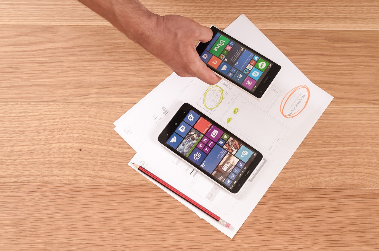
Do not just glance at your homepage and decide that everything looks fine. Try to complete the same basic tasks a customer would.
Can you open the navigation menu and reach every important page? Can you tap the phone number without accidentally hitting something else? Can you find your services, hours, location, or contact information without digging through the site?
Pay close attention to:
- Buttons that are too small or too close together
- Navigation menus that do not open or close correctly
- Popups that cover the screen and cannot be dismissed
- Forms that are difficult to complete
- Images or text extending beyond the edge of the screen
- Sections with excessive empty space
- Pages that load painfully slowly
- Important information buried beneath unnecessary content
These problems may seem small individually, but they pile up quickly. One awkward button probably will not destroy a sale. A tiny button, broken menu, intrusive popup, slow page, and frustrating contact form might as well hang a sign on the website that says, “Please hire somebody else.”
Test the Parts That Make You Money
Every website has a few actions that matter more than everything else. For a service business, that may be tapping a phone number or submitting a quote request. For a restaurant, it could be viewing the menu or getting directions. For an online store, it is finding a product and completing checkout.
Test those actions from beginning to end on your phone.
Fill out your own contact form. Add one of your products to the cart. Open your map. Tap your email address. Call your business using the phone button. If the process feels slow, confusing, or annoying to you, imagine how it feels to someone who has no patience and five competitors waiting in another tab.
A website can look beautiful and still fail at its actual job. I have written before about the role of user experience in website rankings, but the issue goes beyond search engines. A frustrating mobile experience can stop a real person from contacting your business.
Check More Than One Screen

Your phone is the obvious starting point, but it should not be the only test.
A website can look fine on one device and fall apart on another because phones and tablets come in different sizes and orientations. Rotate your phone sideways. Test the site on another person’s device. If possible, compare an Android phone, an iPhone, and a tablet.
At K-Wired.com, I use a custom design process with preset controls for testing mobile responsiveness. Those controls are combined with established design standards and real-world mobile testing. The goal is not merely to make a website pass an automated check. The goal is to make sure an actual person can comfortably use it.
Automated previews are useful, but a website ultimately needs to survive contact with a real thumb.
Watch for Business Problems Too
Sometimes a business owner notices the effects of a poor mobile experience before identifying the cause.
You might receive website visits but very few phone calls. Customers may start a form without submitting it. Shoppers may add products to their carts without completing checkout. Someone might even tell you that your menu or contact page would not work on their phone.
Those signs do not automatically prove that mobile design is the problem, but they give you a reason to investigate. Start by completing the customer journey yourself. You may discover that a form field is hidden, a button is difficult to press, or a popup is blocking the exact information people came to find.
Fix the Small Problems First
A mobile issue does not always require a complete website rebuild.
Start with the small things and see whether the experience improves. Increase the font size. Add spacing between buttons. Remove an intrusive popup. Simplify the menu. Compress oversized images. Shorten a form that asks for far more information than the business actually needs.
Then test everything again.
If the problems continue across the entire website, the issue may be deeper than a few bad settings. The site may have been designed around desktop screens without a proper mobile structure. It may use an outdated template, rigid layouts, or a platform that makes every repair create two new problems elsewhere.
That is usually when it makes sense to stop stacking patches on top of patches and consider a professional redesign. My guide to deciding between DIY website work and professional help can help you judge where that line falls.
Your Mobile Website Is Your Website

For many customers, the mobile version is not a secondary version of your website. It is the only version they will ever see.
Open your site on your phone and be honest about the experience. Is the text comfortable to read? Are the sections properly aligned? Can you use the menu, press the buttons, complete the forms, and find the information that matters?
If something looks off to you, it probably looks off to your customers too. Fix the small problems first. If the entire experience still feels broken, K-Wired.com builds mobile-ready small-business websites designed to work in the real world—not just inside a desktop preview.