
🚀 Best Methods to Build a Fast Website: The Speed Secrets of Modern Web Design
🌐 Introduction
In today’s fast-paced, scroll-happy world, the speed of your website isn’t just a luxury—it’s the foundation of user experience and search engine visibility. Google has made it crystal clear: page load times directly impact bounce rates, conversions, and SEO rankings. Whether you're a small business owner, designer, developer, or DIY enthusiast looking to get your business online, you need to know how to build a fast website.
But what does "fast" really mean in 2025? We’re talking about pages that load in under 2 seconds on average connections, respond instantly on mobile, and score top marks in Core Web Vitals. If your site isn’t blazing fast, you’re likely losing visitors before they even see your content.
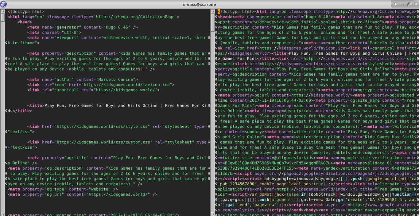
This guide dives into the best methods to build the fastest websites possible—and spoiler alert: it turns out that the simplest, oldest method is still the fastest. Using raw, unmodified HTML, CSS, and JavaScript—without relying on external libraries or frameworks—can outperform even the most modern development stacks in terms of speed and efficiency. (In developer speak, this is often called "vanilla" HTML, CSS, and JS.) Let’s explore why this foundational approach can beat complex frameworks in a speed test, and how you can use it to your advantage.

📚 Part 1: Understanding Website Performance
Website performance refers to the speed and efficiency with which a webpage loads and becomes interactive for the user. This metric plays a pivotal role in how people experience your site and how search engines evaluate it. Performance affects more than just convenience—it directly impacts SEO, user retention, and conversions.
Google uses a set of standards called Core Web Vitals to gauge whether a page is providing a good user experience:
Largest Contentful Paint (LCP): Time it takes for the largest element (like an image or headline) to load. Aim for under 2.5 seconds.
Interaction to Next Paint (INP): Measures how quickly the site reacts to user input. Keep it under 200 milliseconds.
Cumulative Layout Shift (CLS): Ensures your content doesn’t jump around as it loads. Should be less than 0.1.
Meeting these benchmarks not only helps your site rank higher on search engines but also provides a smoother experience for visitors.

⚙️ Part 2: Code Optimization for Maximum Speed
✂️ Minification
Minification is a powerful strategy that strips away anything unnecessary from your HTML, CSS, and JS—like whitespace, comments, or formatting. This makes the file sizes smaller, which means your site loads faster and performs better.
⏱️ Defer and Async JavaScript
JavaScript can slow down your site if not handled correctly. Use defer to ensure scripts load after the page is parsed, and async for independent scripts that don’t rely on other elements.
<script src="/app.js" defer></script>
[Insert image: Flowchart showing when defer and async are used]
🖼️ Lazy Loading Images
Images often weigh down a page. Use loading="lazy" so images load only when they enter the user’s view.
<img src="/hero.jpg" loading="lazy" alt="Hero Image">

🧱 Part 3: Clean Structure for HTML, CSS & JavaScript
🧩 Semantic HTML
Using meaningful tags like <header>, <nav>, <main>, and <footer> helps browsers and search engines better understand your layout. It improves accessibility, speeds up rendering, and boosts SEO.
[Insert image: Example of semantic HTML layout structure]
📂 Consolidated CSS
Instead of spreading styles across multiple files, use one minified stylesheet. Inline only the most critical styles above the fold, and defer the rest using preload.
<link rel="preload" href="/styles.css" as="style" onload="this.onload=null;this.rel='stylesheet';">
✨ Minimal JavaScript
Keep JavaScript simple and lightweight. Use plain JS where possible. For small interactive elements, Alpine.js (~10 KB) is a good option. Avoid heavy frameworks unless absolutely needed.
[Insert image: Size comparison chart of various JS libraries]

📱 Part 4: Mobile Responsiveness
🔧 Viewport Meta Tag
This tag ensures your content fits properly on all screen sizes.
<meta name="viewport" content="width=device-width, initial-scale=1">
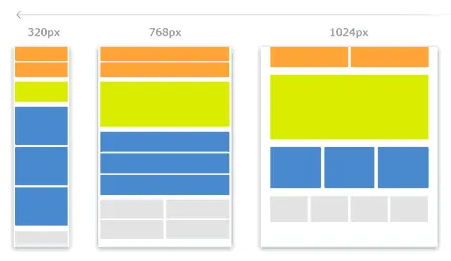
📐 Mobile-First CSS
Start your CSS with mobile layouts and scale up with media queries.
body { font-size: 16px;}@media (min-width: 768px) { body { font-size: 18px; }}
📊 Responsive Layouts with Flexbox/Grid
Use modern layout systems like Flexbox or CSS Grid to create dynamic, flexible designs.
.container { display: flex; flex-direction: column;}@media (min-width: 768px) { .container { flex-direction: row; }}

🔍 Part 5: SEO Best Practices (Speed + Search Power)
Search engine optimization is crucial to getting found online—and it's not just about keywords. Site structure, load speed, and content clarity all play a role in ranking. Here’s how to make your site more discoverable:
One <h1> per page: Use a clear, descriptive headline with your primary keyword.
Meta Descriptions: Write compelling summaries that appear in search results.
Alt Tags on Images: Help search engines understand what your visuals depict.
Avoid Duplicate Content: Ensure each page has unique, original text.
Clean, Hyphenated URLs: Use URLs like /about-us instead of /page123?id=7.
Canonical & Robots Tags: Guide crawlers and avoid content conflicts.
🧠 Sample Head Section
<head> <title>Fast Website Design Tips | K-Wired</title> <meta name="description" content="Learn how to build a fast-loading, mobile-friendly website using raw HTML, CSS, and JS."> <meta name="viewport" content="width=device-width, initial-scale=1"> <link rel="canonical" href="https://k-wired.com/fast-web-design"></head>
📊 Part 6: Real-World Performance Comparisons
🧪 Example 1: Raw HTML/CSS/JS Site
This type of site is the fastest. No frameworks, no fluff—just performance.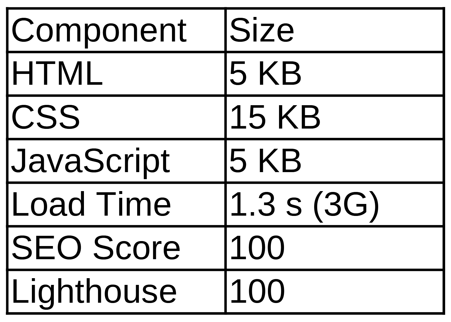
[Insert image: Speed metrics and visual timeline for plain-code site]
⚖️ Example 2: Tailwind + Alpine Stack
This setup balances performance and flexibility with great results.

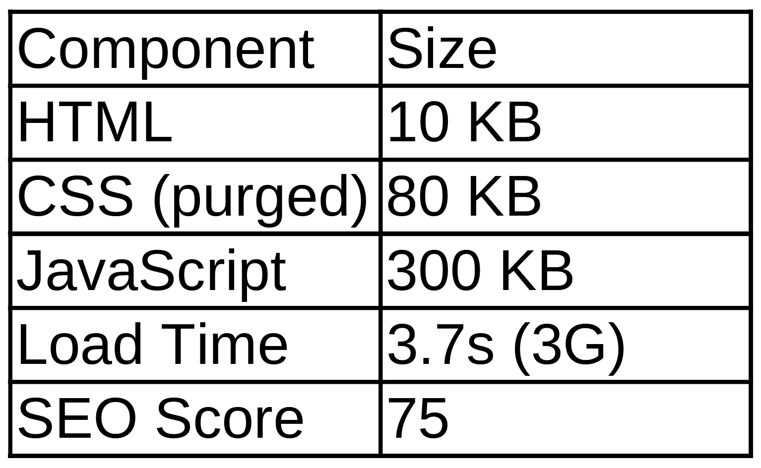
🧱 Example 3: React Single-Page App
Highly interactive, but heavier and slower to load—especially on mobile.


✅ Conclusion: Simplicity is Still the Winner
When it comes to speed, nothing beats a clean, focused build. A site using raw HTML, CSS, and JavaScript will always load faster and perform better than one weighed down by heavy frameworks and unused libraries. Whether you go fully custom or add just a few helpful tools, performance must stay front and center.
The best websites today are:
Fast (load in under 2 seconds)
Responsive (mobile-first and flexible)
SEO-Ready (optimized tags and clear content)
Efficient (no extra scripts or styles)
So if your goal is to deliver the best user experience possible—and rank high while doing it—start with a lightweight, performance-first mindset.